

Amazon Prime Video Redesign Mobile App:
Enhancing Movie Searching Experience
User Research
Visual Design
Product Design
Prototyping
Role
10 weeks Sep - Dec 2022
Duration
Figma Maze Miro
Tools
Solo
Team
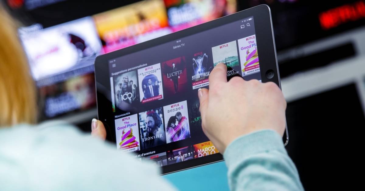
Frustrated with endless scrolling for movies? Discover how the Prime Video Redesign mobile app project revolutionized movie searching, maximizing user satisfaction and app usage. The Prime Video Redesign app is here to streamline user experience.
Why It Matters Improved organization and user-friendly features not only elevate app engagement but also contribute to higher subscription renewals. This transformative shift in user interaction enhances satisfaction with the Prime Video Redesign app, ensuring a more seamless and enjoyable experience
OVERVIEW

Prime Video users struggle with cluttered navigation, endless scrolling, and an unintuitive search bar when choosing a movie. This leads to distraction, time-consuming searches, and decreased user interest.
User Insight: “I love watching new shows! My frustration is when I have to decide what to watch next. There are too many choices and it overwhelms me.” - Emma
PROBLEM
GOAL
Create an intuitive and accessible interface for quick and satisfying decision-making. Improve browsing and selection experience, minimizing endless scrolling and maximizing engagement.
How Might We improve users' browsing and selection experience on the Prime Video app, minimizing endless scrolling and maximizing engagement?
DESIGN OPPORTUNITY

DESIGN SOLUTION
Using the Double Diamond process, I optimized Prime Video's app with intuitive filters, personalized recommendations, and reduced cognitive load, creating a user-friendly interface for improved engagement.
DEFINE

Created a user persona (Melisa) representing target audience needs and goals based on research data.
User Persona

Developed an empathy map to understand user perspectives and pain points.
Empathy Map
Goal: Efficiently find a movie to watch after working, using the filter feature to select her preferences.
User Journey Map

EMPATHIZE
Additional research deepens our understanding, solidifying insights into the pain points discovered through Melissa's experiences
Do you have any thoughts on helpful features that can help you quickly choose a movie/show?
Quantitative Research

Participants provided valuable insights on their show selection experience, highlighting frustrations and suggesting features for enhancement.

DISCOVER

Conducted competitive analysis, studying strengths and weaknesses of competitors like Netflix, Hulu, HBO Max, and Disney+.
Gathered valuable user insights through surveys to tackle endless scrolling and optimize movie selection.
Competitive Analysis
Research Insights

DESIGN PRINCIPLES
1. Discoverability
Ensure the filter feature is easy to locate and use. Analyze user behavior to create an intuitive interface and provide clear instructions.
2. Consistency
Develop a cohesive, approachable design that aligns with the app's overall user experience. Incorporate innovative features that enhance usability and use consistent design patterns and language to create a familiar user experience.
3. Show don't Tell
Provide helpful and concise feedback to guide users through the filtering process. Use visual cues and messaging to highlight important information and features.
DEVELOP
Utilized lo-fi and mid-fi sketches to visualize design concepts.

Lo-fi Sketches
Mid-Fidelity
Catering towards the main flow: Sign in and Apply filter to generate better personalized options

Testing and Improvements

First major improvement
Sign in Screen
Simplify sign-in process
Include an option to remember user sign-in credentials
Highlight the brand's logo for brand recognition

Top Navigation:
Indicate the number of shows that are matched with user preferences
Allow users to personalize their homepage
Content based on major users’ recommendations in the region

Preview Page:
Provide a short description of the show
Display rating for personalized future preferences
Suggest content similar to users' choices

Third major improvement
Filter component:
Simplify and get rid of unnecessary selections
Identify applied options with bold text

Hi-Fidelity

Other Screens

Improved user satisfaction and engagement with streamlined movie selection.
Simplified filter feature reduced frustration and increased discoverability.
Enhanced user interaction through personalized recommendations and engaging UI.
Impact and Results
DELIVER

App Store Marketing
LEARNINGS AND REFLECTIONS
Given more time, I would
Conduct extensive research for deeper user insights.
Continuously refine content curation methods for better recommendations.
Implement effective features for healthier viewing habits and reduced endless scrolling.
Apply the design process to enhance other app areas for an improved overall experience.
Takeaway
Thoroughly understand user needs and behaviors through UX research is crucial for creating effective design solutions.
Focus even more on user research, including conducting surveys and interviews, to gather a comprehensive understanding of user needs and preferences.
Spend more time exploring different design solutions and testing them with users to ensure optimal usability and user satisfaction.